Introduction
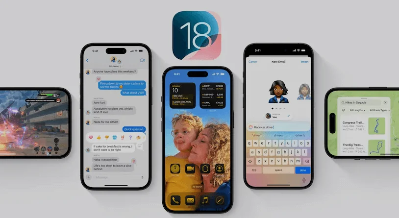
Apple has recently released the third developer beta version of iOS 18, bringing a slew of design changes that enhance the user experience. While there are no groundbreaking new features like Apple Intelligence in this update, the design tweaks are notable. One standout improvement is the redesigned flashlight UI, which now offers more intuitive and functional controls.
Flashlight UI Overhaul
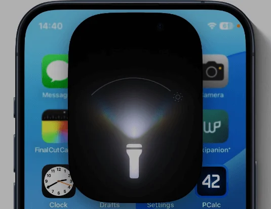
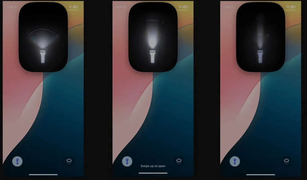
The iOS 18 developer beta 3 introduces a revamped flashlight interface that is particularly exciting for users. The new controls for the True Tone Flashlights, available on iPhone 14 Pro and 15 Pro models, go beyond the traditional on/off and four brightness levels. Now, users can adjust the brightness and the width of the flashlight beam, providing greater versatility.
Previously, the flashlight controls featured vertical and horizontal lines to represent brightness and beam width. While functional, this design required users to familiarize themselves with the layout. The third beta’s new design simplifies this interaction with a curved line that simultaneously indicates both brightness and beam width. Additionally, a dotted curved line at the top of the UI marks the peak intensity of the flashlight.
User Reactions
The reaction to this updated flashlight UI has been overwhelmingly positive. Tech enthusiasts and developers have taken to social media to express their excitement. Twitter user @wilson_boi_101 highlighted the ability to change the focus of the flashlight, exclaiming, “Holy shit! You can change light focus on Flashlight in iOS 18! Dynamic Island looks amazing.”
Sebastiaan de With, another user, praised the new design, tweeting, “OK this new flashlight UI in iOS 18 beta 3 has absolutely no right to go this hard. Too cool.”
Other Design Changes
Beyond the flashlight UI, the third developer beta of iOS 18 includes other noteworthy design updates. One significant change is the automatic conversion of third-party app icons to a dark shade. Previously, only Apple’s native apps featured dark-tinted icons. This shift brings a more cohesive look to the home screen, especially for users who prefer a dark mode interface.
Another aesthetic enhancement is the addition of a new dynamic wallpaper. This wallpaper changes colors based on the time of day, adding a fresh and visually appealing element to the user experience.
Conclusion
In conclusion, third developer beta of iOS 18 has brought alterations in design so as to enrich the user experience. One of the changes for which people were waiting and which has proved to be more viable is the enhanced flashlight options. There is a highly positive reaction to the new design from the tech-savvy community and the developers, who-State, those, that the new design is rather simple and unpretentious. Also, the update brings other design adjustments including an application of a dark tint to icons of third-party apps and a dynamic wallpaper, which energizes the wallpaper depending on the time of the day.
In my own view, at least these design changes are improvements moving in the right direction for Apple. The new flashlight UI is quite remarkable, and having the options to vary the brightness as well as the beam width is a bonus which many people will definitely find helpful. Again, the app icons have a deep color at the background as well as the dynamic wallpaper also feels a bit more premium on the home screen. All in all, such updates define Apple as a company that cares about the user experience and design. Are you in favour of these design changes? Do you looking forward to use the new flashlight UI and other in iOS 18? Share your thoughts!
Read Also: iPhone’s Battery Innovation: Leaves Samsung and Google Behind